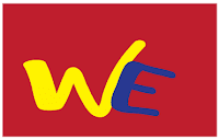
Initial: For this logo, I used two different fonts. Also, i added a box filled with red coloring. All I wanted was something simple, yet creative. I wanted this to pop out to your eye. What do you think? What don't you like? How can i improve?
Name: For this logo, I also used two different fonts. I chose to put my last name in bigger bolder letters because i thought it was more important. However i used small, brighter letters to input my first name so it would pop. I wanted for this logo to express my last name, but also say my first name. What do you think? What dont you like? How can i improve?

Symbol: For this logo, I used the skiing symbol for volkl, incase you didn't know. The Volkl symbol can be two Ws (one upside down and one right side up.) I added the E because, well it resembles my initials WE. I wanted this volkl because i love to ski. What do you think? What dont you like? How can i improve?


I'm digging the Black and Yellow one, it's pretty fresh. Yeah, uh huh, you know what is. The first one is pretty good aswell, maybe you could try stacking them differently or spacing them oddly, something unconventional. and the Third one is pretty confusing to me i thought it was 2 Xs back to back, maybe you could change the colors from top to bottom to show that its not the same object, but 2 Ws nah mean? Good work
ReplyDeleteYour first logo has really smooth clean shapes and your last one is really simple and clean. Your name logo is a little too complicated, making it a little hard to read. I definitely think the last one is the best though it looks more like two "X''s than two "w"'s.You might want to add some type of shape as a background for your last two logos
ReplyDeleteI like your name logo because it is creative, although it is kind of hard to read. Your other two logos are a little too simple, but I like your ideas.
ReplyDeleteI like the first and second ones. The first one is very simple but the colors look good together. The second one was very cool how you put your name inside your last name and you positioned the letters very well. The last one wasn't that good. You didn't really use a symbol and you can barely make out your initials. You should just use a normal and simple symbol.
ReplyDeleteI like the second one the most, because it's nice and simple. The first one in my opinion is alright, but maybe you could try something else like arranging them differently. Also, did you freehand the first? Because the lines are steady and smooth. For the third, I thought your logo read XXE. Maybe you could do a double E (like do the same thing you did to the W) to make it a bit clearer.
ReplyDelete