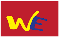
Initial: For this logo, I used two different fonts. Also, i added a box filled with red coloring. All I wanted was something simple, yet creative. I wanted this to pop out to your eye. What do you think? What don't you like? How can i improve?
Name: For this logo, I also used two different fonts. I chose to put my last name in bigger bolder letters because i thought it was more important. However i used small, brighter letters to input my first name so it would pop. I wanted for this logo to express my last name, but also say my first name. What do you think? What dont you like? How can i improve?

Symbol: For this logo, I used the skiing symbol for volkl, incase you didn't know. The Volkl symbol can be two Ws (one upside down and one right side up.) I added the E because, well it resembles my initials WE. I wanted this volkl because i love to ski. What do you think? What dont you like? How can i improve?

